skip to main |
skip to sidebar
 Okay - so where did March go? I drew about a zillion pictures, some of which I will try posting next month... trust me there's only a couple worth sharing - you're not missing out on anything. This was a really fun painting - It has gesso applied unevenly on watercolor paper so when you paint on it a cool texture appears. Oh ya, I didn't bother stretching the paper before-hand, so if you were to see the original it has a lovely ripple-effect... I should really know better!
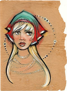 Well, I shouldn't have spent any time doing this... But there you have it!

 Just some pink sketches - I have to apologize for some of my scans recently. One of the scanners I use is very nice at accurately scanning & the other one is just awful & wants to auto-correct everything for you. (It's like a little kid that cuts their own hair thinking they're doing mommy a favor...)
Anyway, I got the new James Christensen book & I love it! I actually met him over the summer at the Twiggs & Moore Gallery & he's such a nice person. He drew a picture while he was there & gave previews of some of the paintings that appear in this book. (I don't quite know about his whole "well-dressed man/hunchback" characters, but I love his figurative work, details & textures.) I think he also figures that you can never paint too many profile views! (or fish...) I wonder if he does teaching workshops...
 One of my very good friends from work, Nicole, is getting married this January & asked me to draw a picture of her & her fiance. They were so much fun to draw & I'm so happy that she loves how it turned out! They are the cutest couple ever :) I even had that song "So Happy Together" running through my mind while I was drawing it (& I'm sure they will be)!
 I think we all feel like this sometimes. I'll probably do a finished version of this someday.
 Well, this is definitely not the best thing I've ever done, but it's also not the worst. I wish I could carry the energy from the sketch stage through to the finished piece. (Wow, check out that rustic-looking chalkboard - looks like it was pulled out of a lake!) I was a little concerned about the chalk boxes looking like they were cigarette boxes for some reason... apparently Goobley's a two-pack-a-day monster! (But he's trying to quit.)
Anyway, enjoy these monster sketches:

 Start with an abstract shape - then make a bird out of it.
 That's right folks - break out the old 3-D glasses & take a gander at them snowflakes! -
Thanks to Jake for the idea! :)
 I think this chair is an optical illusion.
 I have been pretending to be Mary Blair today. Heard of her? She was an incredible concept artist for Disney during the 1950's & worked on films like Alice in Wonderland, Peter Pan & she designed the characters from It's a Small World! She has the cutest way of drawing children - So I drew up a little girl in footy-pajamas. It reminds me of Christmas when I was little, although I never actually had footy-pajamas, but I did get a brand new pair of pajamas that my mom sewed for me. They were so special, I just loved them!
 This is just something out of my head one night when I was really tired & couldn't get to sleep. :)

 I just love working in black & white! It's so much easier than color!! :)
These are from when I was young & naive... okay they're actually from a couple of years ago. I was digging through my old things and can remember how much I loved working on these two pictures.
The first is sort of a mechanical "unicorn" I drew while I was watching Aliens and the second is the interior of a car, both were done as assignments in illustration classes. :)
 Whoa - I just realized that if I had made this girl a blonde she'd look like Janice from the Muppets! (well, sorta...) weird.

 More col-erase sketches! I would love to do a children's story starring these characters! -- The bunnies were so fun I couldn't stop drawing them! (I think I have about 10 pages of just bunnies!!). :)
 Another charcoal on newsprint. I really struggled on this one - it didn't look like it was going to make it until the very end. I wish I'd been able to sit on the other side of this model - she had a few of these seashells throughout her hair and all I could see from my angle was the one on top. :( Great model though, lots of fun to draw.

 I think this is my favorite figure study from last semester, although the bandanna she's wearing should have been much lighter and I wasn't able to finish the body (oh well...). I was trying to work the whole dark against light and light against dark thing, along with lost edges. Charcoal on newsprint.
This was a practice piece I did last summer. I was trying to practice painting on the computer since I hadn't done much art for about a year. (Seriously, I had to spend a year taking only general ed. classes - long story short not all associate degrees transfer...) It was probably the worst year I've ever spent in school. Anyway, I was transferring schools and was worried that I'd forgotten how to even draw. (It could happen!) So, this was practice so I wouldn't embarrass myself at the new school. I did a few sketches and picked one that I liked:
 First, I sketch the drawing with a col-erase pencil, usually magenta or cyan. Then I do a line drawing over top of that with a super soft (6B-8B) pencil.
 I scan the drawing into photoshop and remove the color-sketch in the Hue/Saturation menu by adjusting the lightness of that particular color. I do a few more adjustments (like levels, erasing stray lines, etc.) and then I set the layer mode to multiply. I chose an old paper for the background to add a little texture.
 I started painting the BG first because I knew I wanted to use this blue color and set the mood with it. I like the way art nouveau has color washes, so I think I was going for that look. What I did here is select everything I want to apply the color to and made a layer mask over a gradient of the blue. I use layer masks all the time. Same thing with the texture, it's on a layer with the same layer mask as the gradient.
 Again with the figure - layer masks. Once I make a mask for what I want to color, I don't ever have to worry about staying in the lines and I can do fast gradient or texture effects on a specific area if I want to. My favorite brush to paint with is the very last one in the dry media library. I usually set it to a low opacity.
 This is really kind of a long process and I'm not really sure if I like it that much. It's probably not that much faster than traditional methods, but it's way easier to make changes. There's so many ways of doing the same thing that I wonder if I'm not doing things the long way.
 So, here's the finished piece. I'm not completely happy with it (that drawing - yikes!), but I've definitely done worse. I learned a lot about digital painting by doing this piece and it helped me dip my feet back into the digital-water.